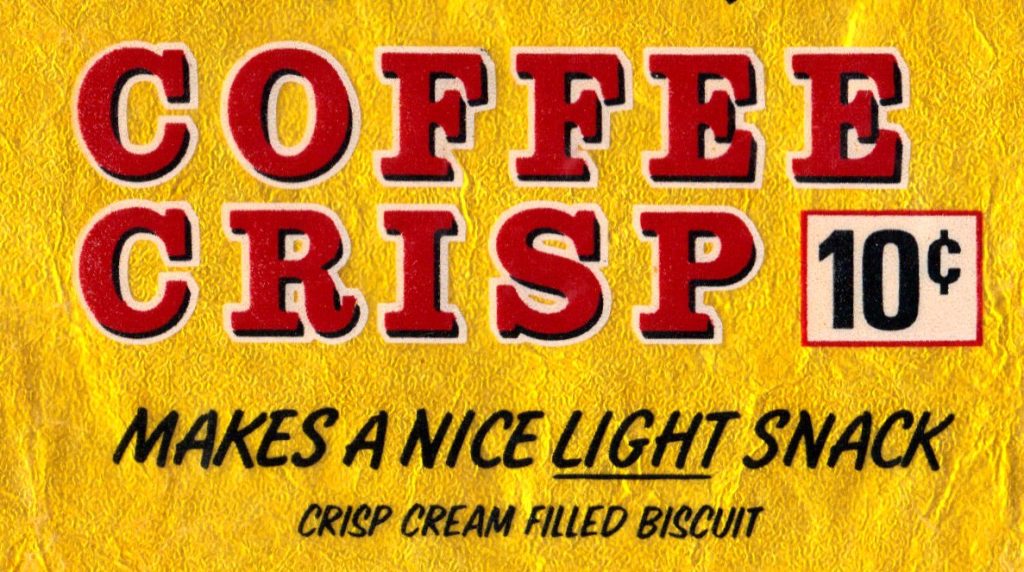
Makes a nice light snack
Halloween, the festival of snacks, reminded me to review my candy wrapper collection (mostly saved in the 1970s). I’ve posted a couple of blogs before about candy ephemera but it turns out I have not shown you some of my favourites. (Blogs here and here.)
For example, look at these Neilson beauties from the early 1970s, and delight in the elegant typography.
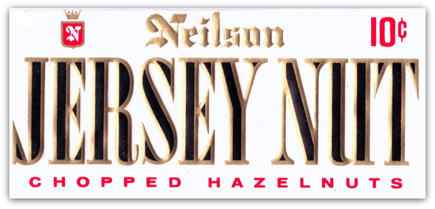
I swoon at how the B and R invade their neighbours’ territory. All that beauty, and a tasty chocolate bar too. For 10 cents.
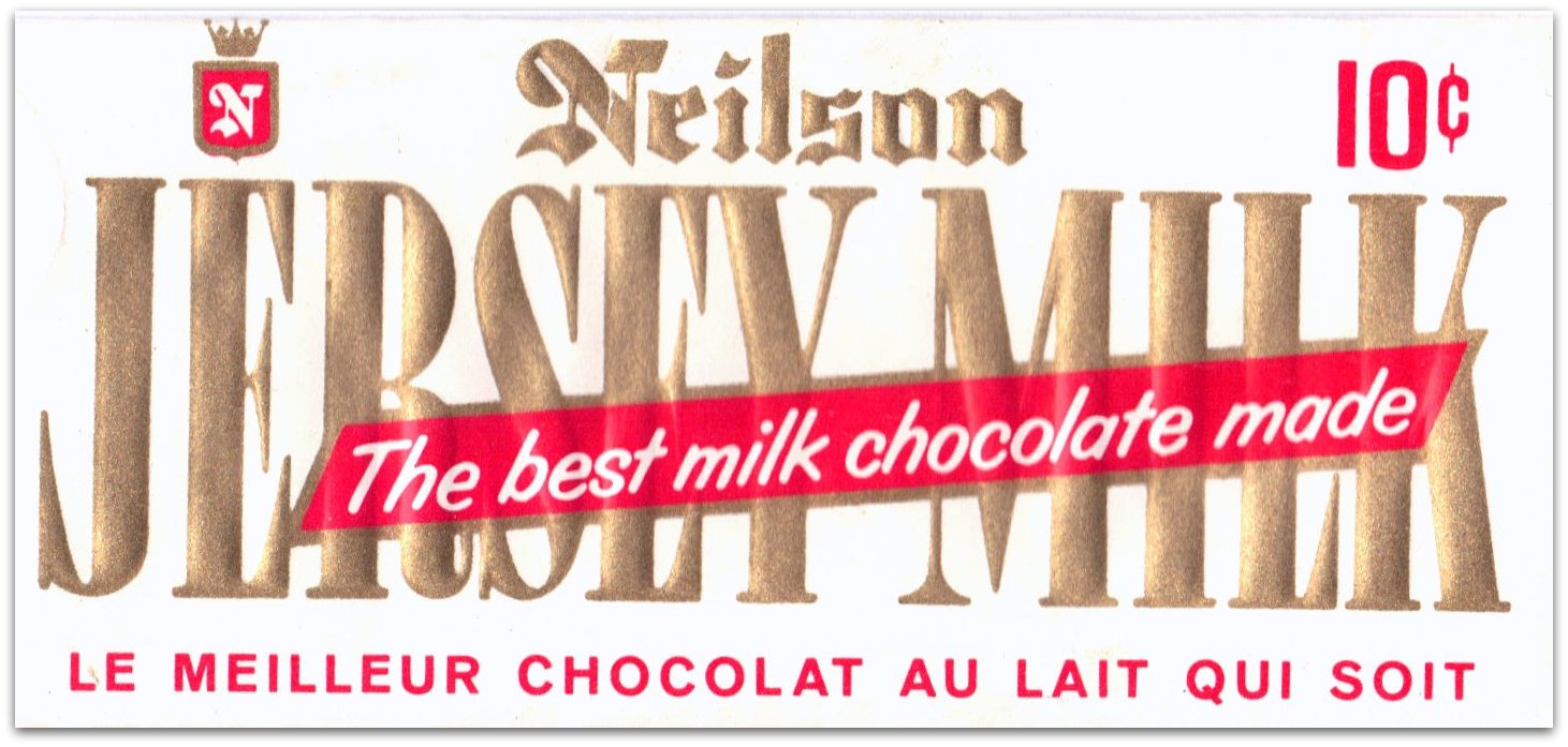
But then, someone loses their nerve and spoils the design with a silly message on a jarring banner.
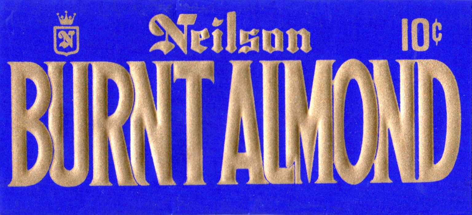
Later in the 70s, the Burnt Almond design, that gave me such a thrill, had lost all subtlety.
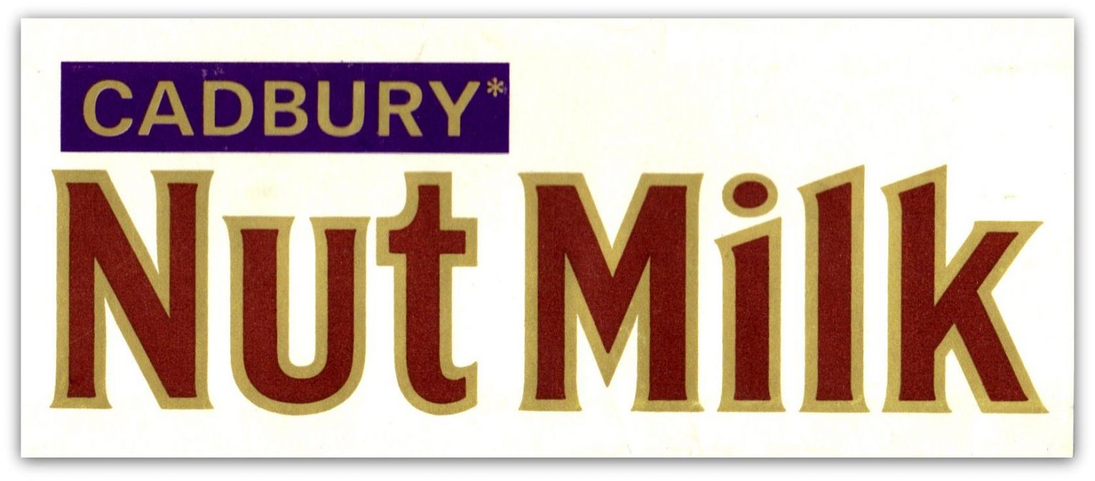
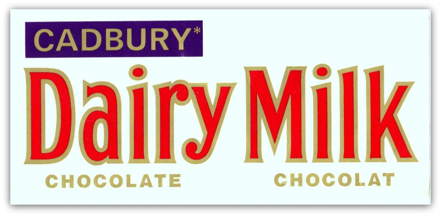
Cadbury also had a strong, type-based design concept.
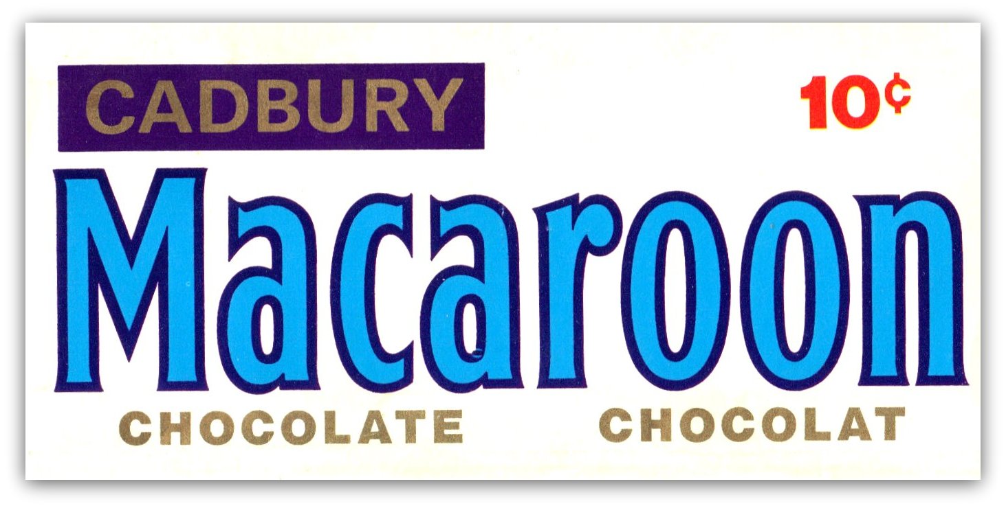
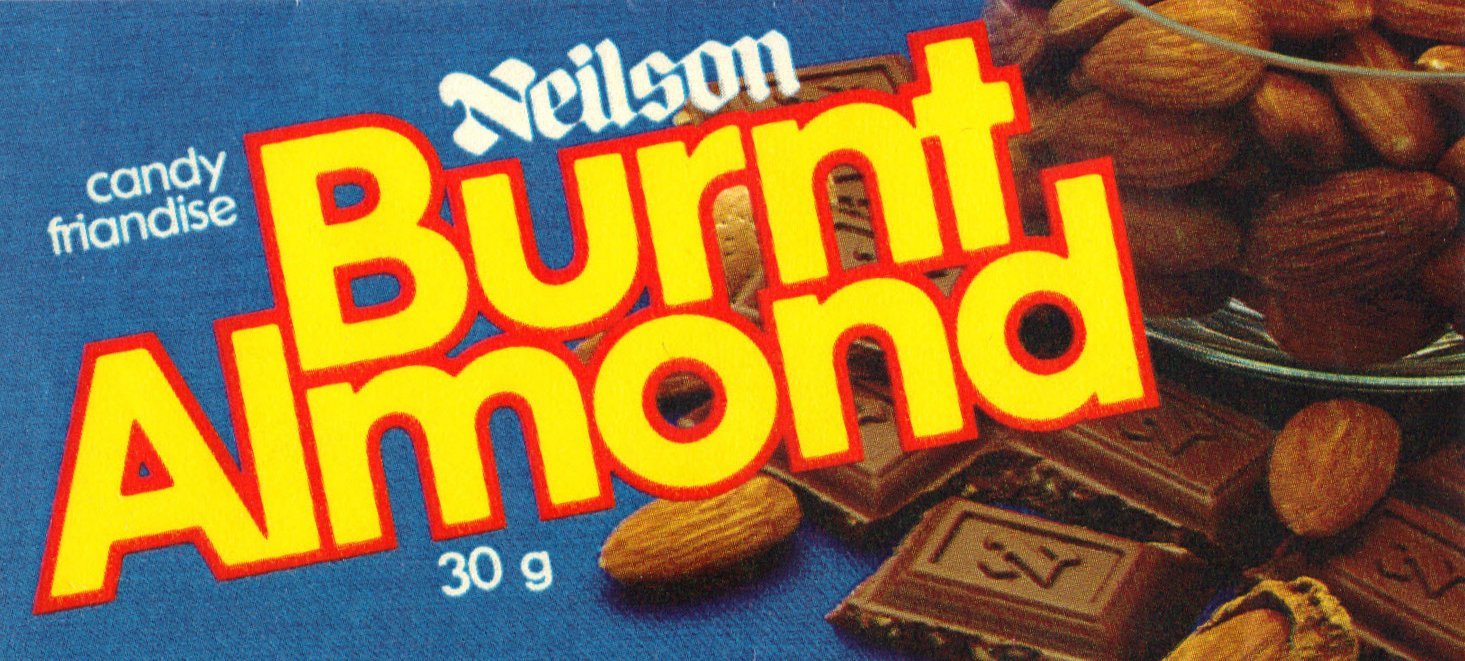
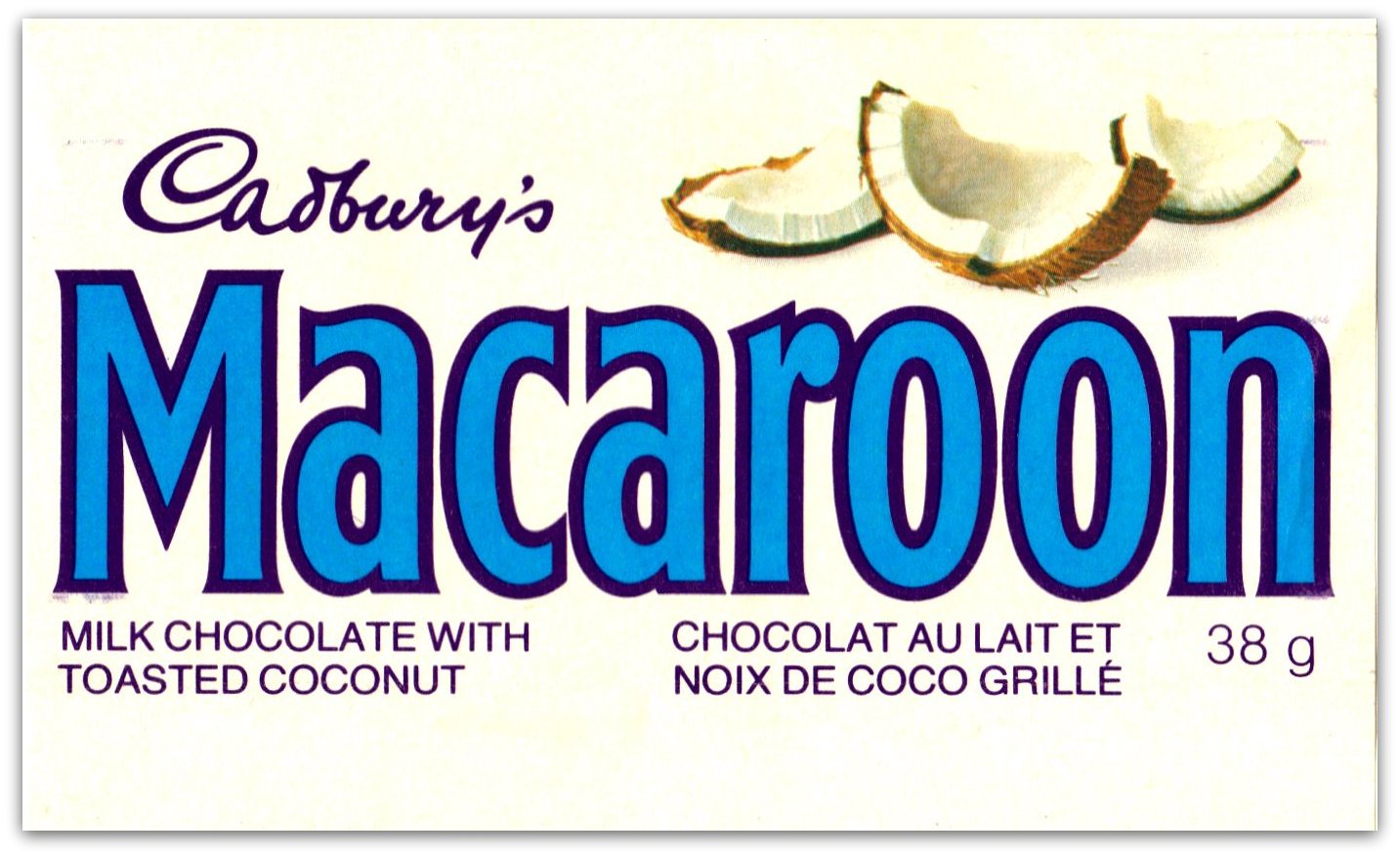
When companies stopped putting a price on their bars there was room to include an illustration.
It felt like the Treasures bar was intended for old people. Six individual chocolates were joined together, like a grandmother’s box of chocolates, miniaturized. Beware of the Turkish Delight.

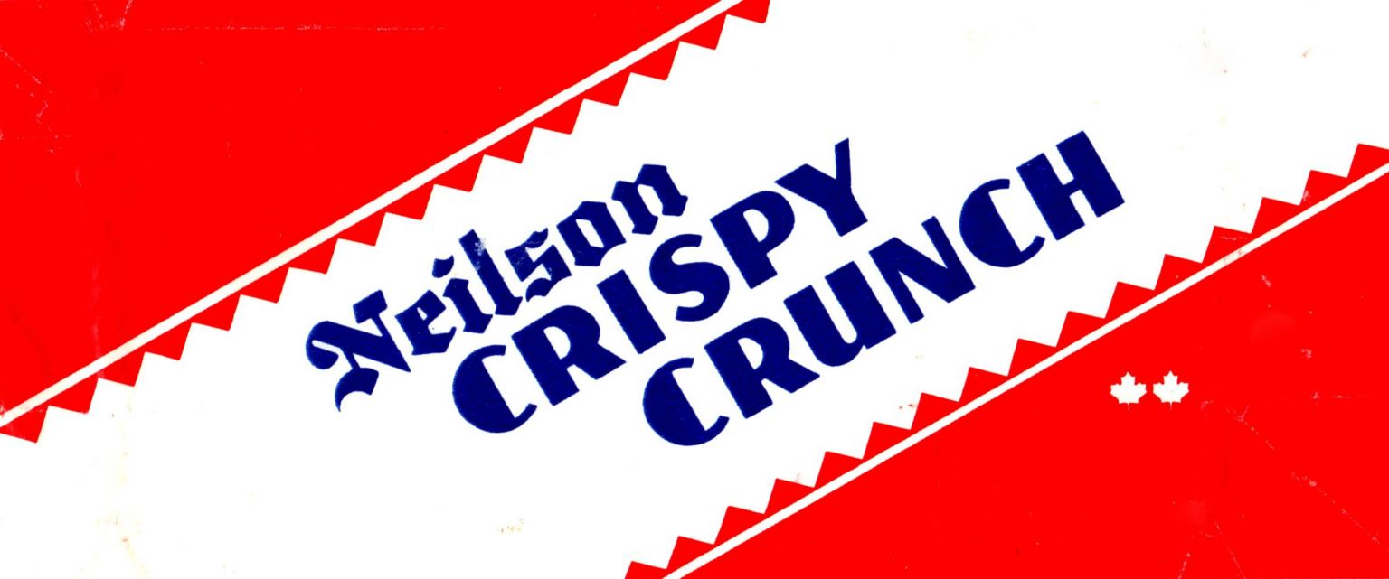
The Crispy Crunch typeface looks like it had been around since the 1930s.
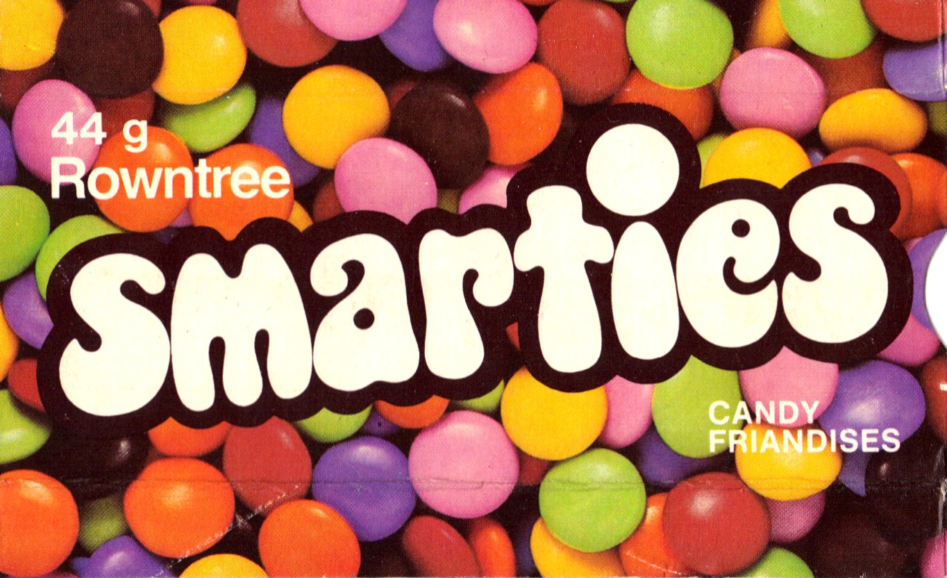
And the Smarties font felt like it came from San Francisco in the 1960s.
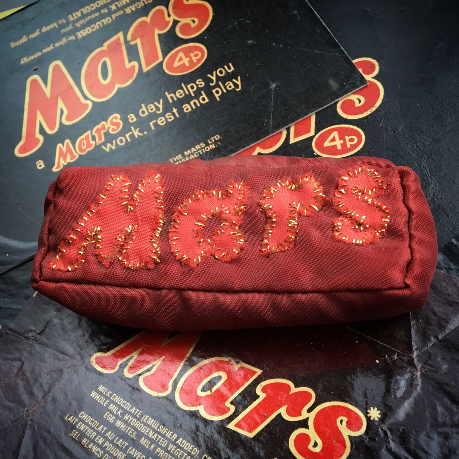
My little adventure in wrapper saving began while I attended museum school in England in 1971. I was a big fan of British Mars bars that boldly claimed “a Mars a day helps you work, rest and play.” To commemorate this affection, one of my museum school colleagues made a needlework Mars stuffed with potpourri, that still retains a faint aroma of the 70s.
Postscript
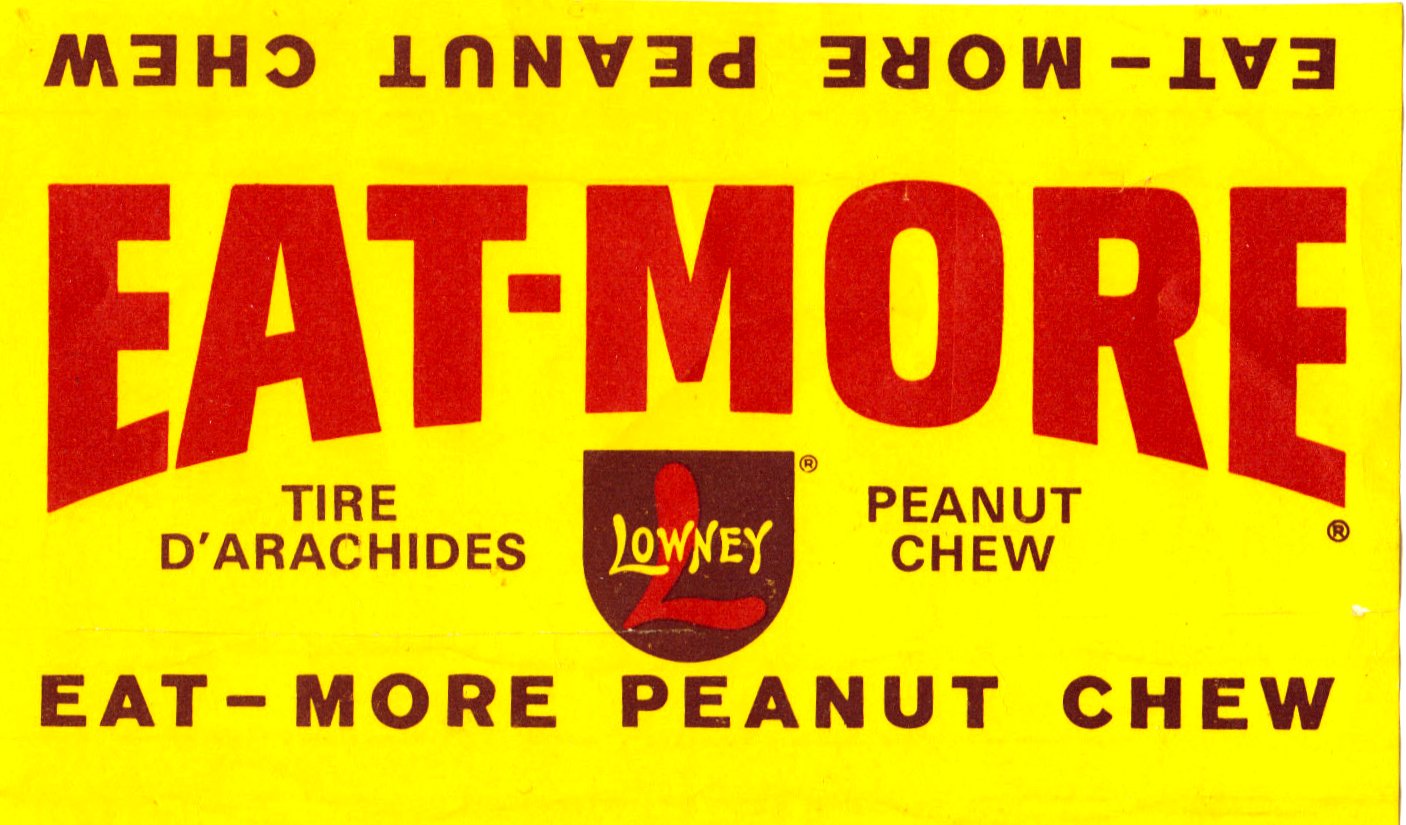
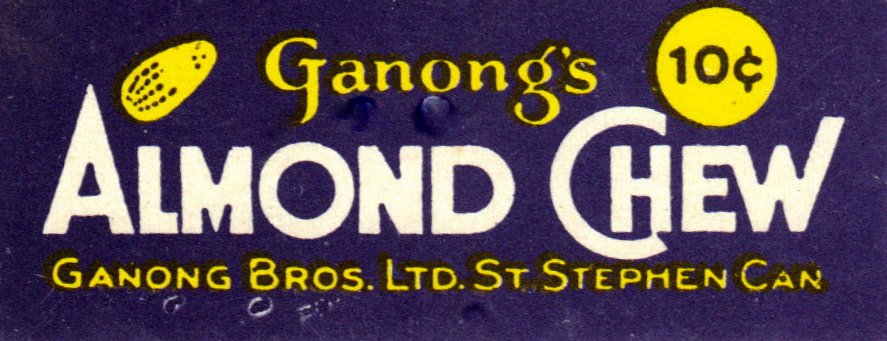
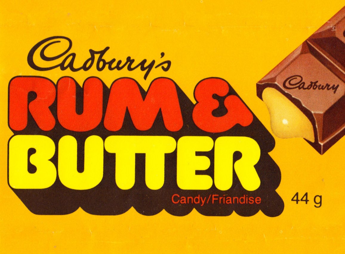
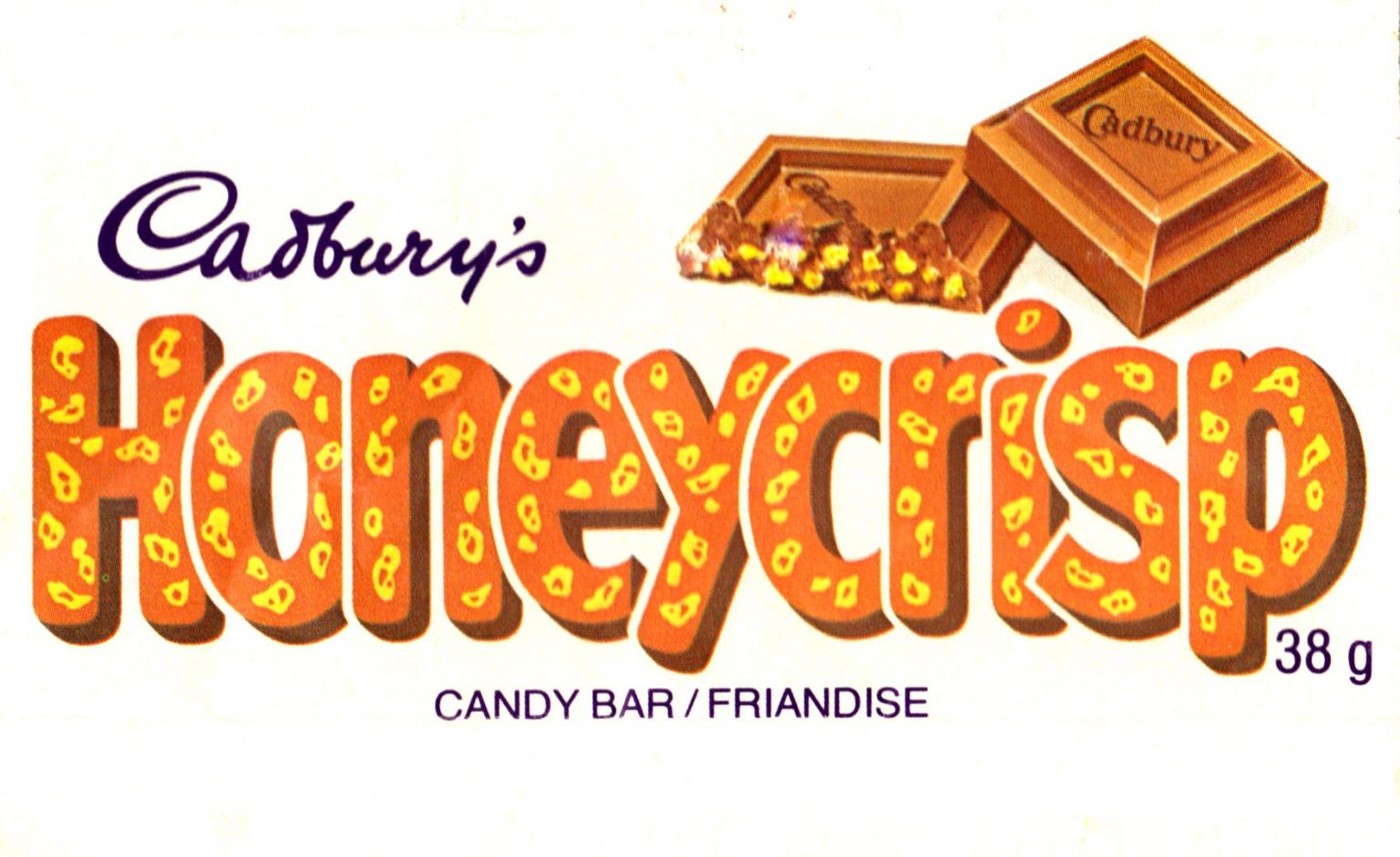
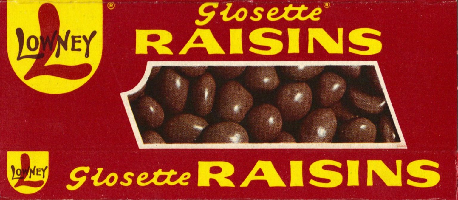
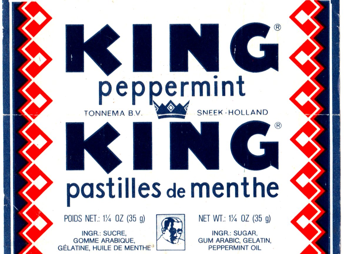
And just so it feels like there is just too much candy (and the labels are already scanned), here are more sweet and chewy memories.