


A lot of you are fans of the podcast 99% Invisible, “a tiny radio show about design, architecture & the 99% invisible activity that shapes our world.” It is breezy and fascinating and the host Roman Mars is a treasure. If I had a podcast I’d want to sound exactly like Roman.
The programs appeal to anyone who is interested in the world around them. Topics consistently surprise and amaze: the story of the inflatable tube people you see at car dealers, the history of the revolving door, the creation myth of skateboard parks. Can you understand why I’m such a fanboy?
Every once and a while I think about annotating a 99% Invisible program with local content or use one of their programs as a background resource for a local discussion. I noticed an opportunity to do this when Trevor Adams, the editor of Halifax Magazine, started tweeting about Halifax’s unfortunate experiences with city flags.
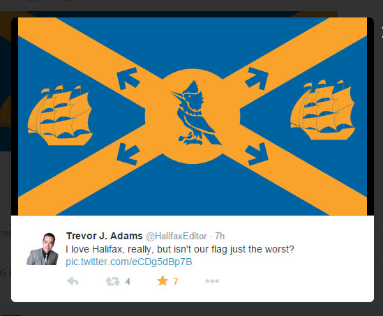
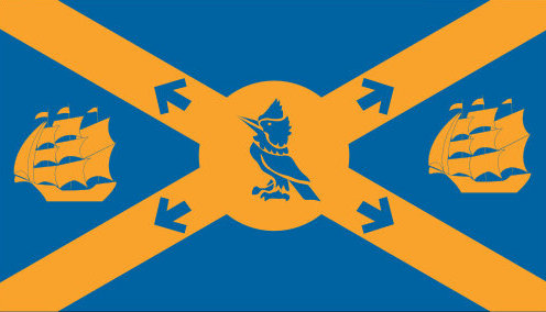
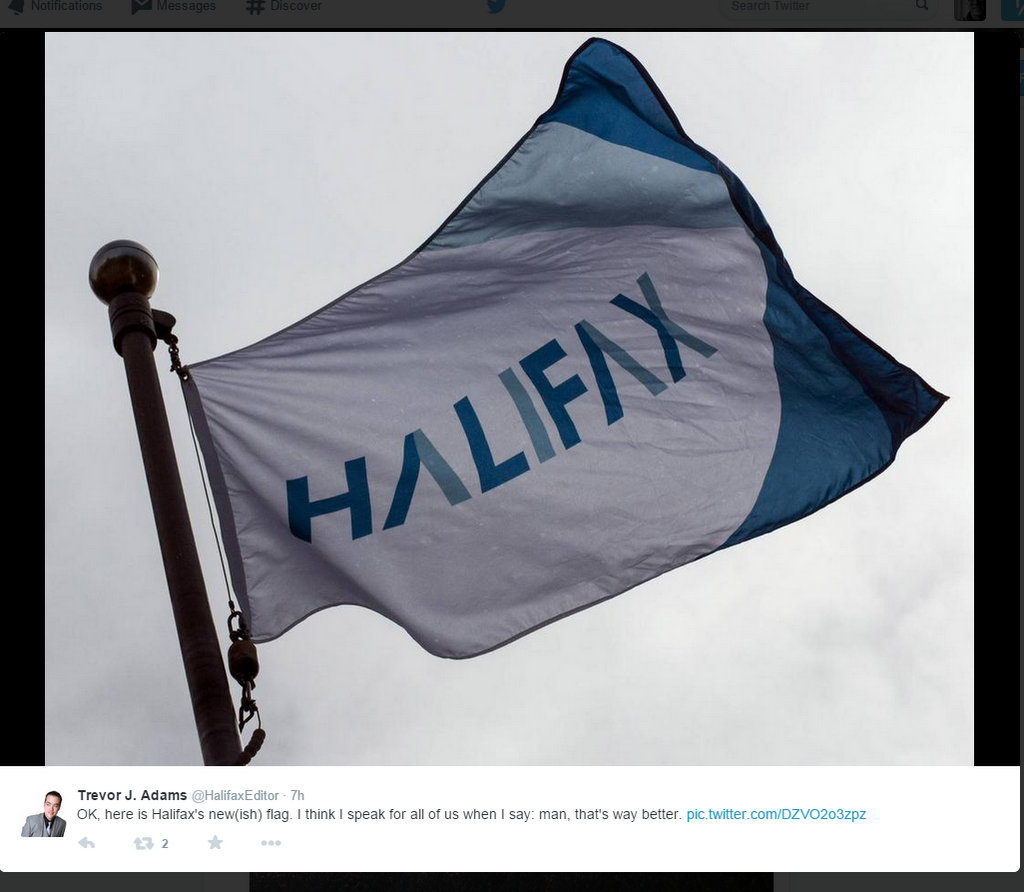
This is truly awful but if it ever really was our flag it is not any more. Our official flag may still have the old lighthouse logo on it. There is a flag that uses the the new city brand:
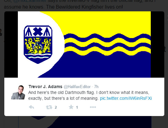
And Trevor also posted the old Dartmouth flag:
This is where 99% Invisible becomes helpful. They did an amusing program on how Portland Oregon got a good flag, finally. Be sure to listen. Most useful for Halifax, they provide principles of flag design, according to the North American Vexillological Association (people who study flags):
1. Keep it simple
2. Use meaningful symbolism
3. Use two to three basic colours
4. No lettering or seals of any kind (take note)
5. Be distinctive
Another useful exercise they suggest is to draw a flag design in a 4 cm by 2.5 cm rectangle. Viewed from 40 cm it will look like a standard size flag flying 30 metres away.
I guess it would be nice to have a flag and I’m happy to have the pros do the designing. But I feel safer having some principles to use for judging submissions .
