


This week Halifax Examiner linked to a story about a branding proposal that the town of Yarmouth is working on. Their consultants recently presented a word mark concept and a recommendation for a tagline: on the edge of everywhere.
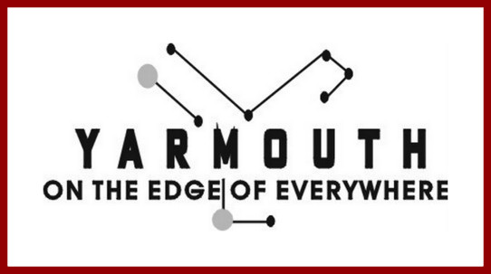
I’m fond of Yarmouth and was pleased to hear they are thinking about their identity. Commenters on the Examiner site were not instantly won over by the concept and some were a bit rude, the little scamps.
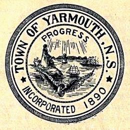
A while back I looked at Yarmouth’s original town crest, adopted when the town was incorporated in the 1890. At that time Yarmouth had been an internationally significant ship owning centre and was expanding and diversifying its industrial base with iron foundries and textile mills.
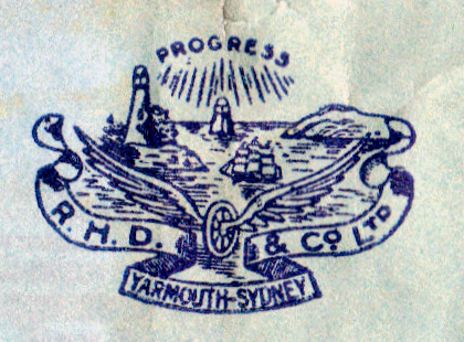
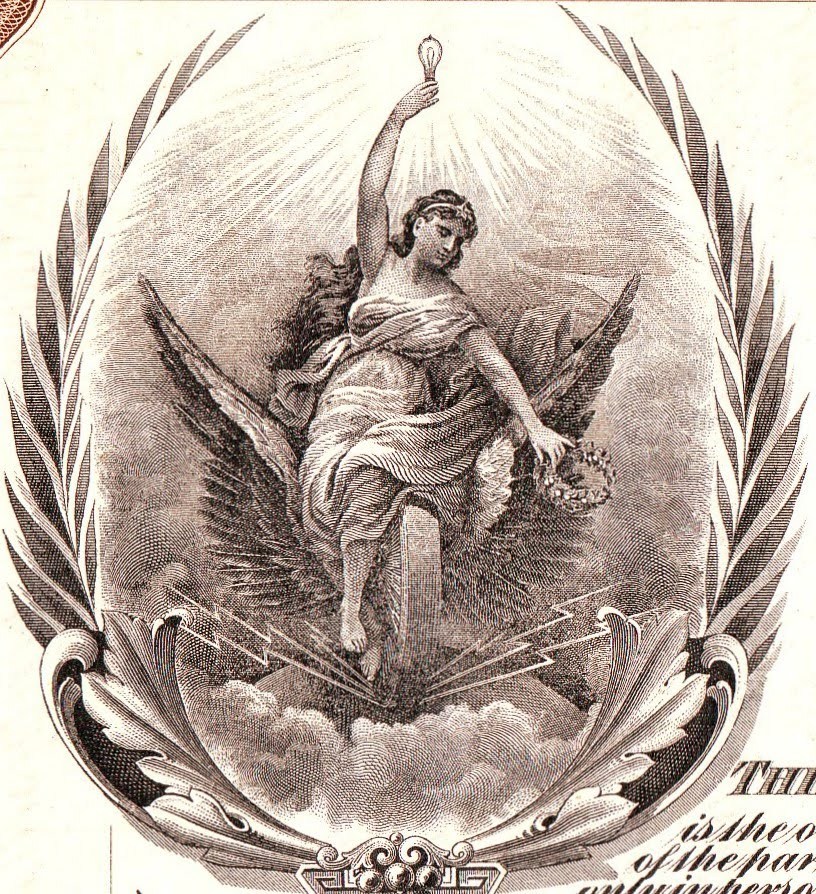
In this early version of the town crest from the Yarmouth County Museum collection a full rigged ship is sailing past the Yarmouth light, in the foreground is the winged wheel of industry and shining down from above are bright rays of Progress.
On the Town’s Facebook page is an updated version of this crest. The ship has been replace by a stylized sloop sailing beside the present day Cape Forchu lighthouse, the wheel of industry has been replaced with a winged ship’s wheel, and progress still reigns supreme but its rays have been co-opted by the lighthouse.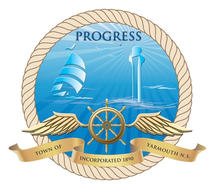 I suspect we can all agree that it is the right time for a change. And this is where my story goes in a different direction. Hold on to your pants.
I have Davis relatives from Yarmouth – my grandmother’s brother started a paper and printing business there in 1897 called R.H. Davis & Co. Two years ago there was still a painted sign on the side of their old building.
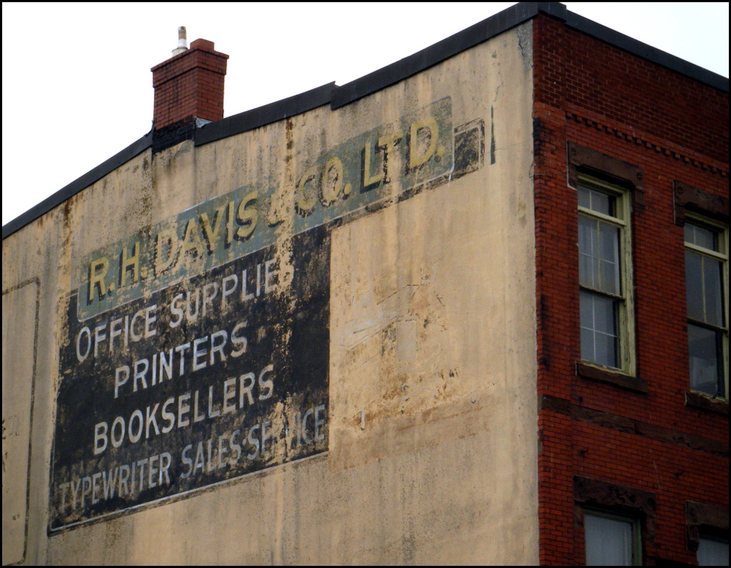
I was surprised to realize that in the early 1900s R.H. Davis & Co. borrowed the Yarmouth crest as their company trademark (it would make quite a nice traditional style tattoo).
Here is the bit that is hard to believe: I discovered the trademark on wrappers for their own brands of toilet paper. The one complete wrapper I’ve seen was for Markland Fine Boudoir Tissue. Yarmouth long had dreams that early Norse settled in that area and Markland is a name from the Norse sagas. It was also the name of a grand tourist hotel located at the mouth of Yarmouth harbour in the early 1900s.
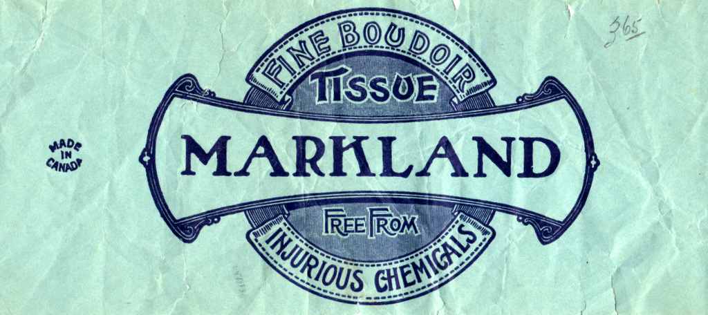
“Free from injurious chemicals” is a sly suggestion that the other brands were loaded with the stuff!
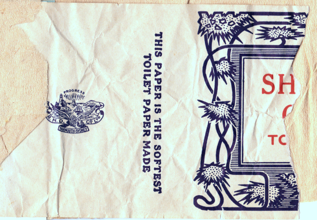
This label came from a fragmentary booklet of toilet paper samples that were in my grandmother’s house in Bridgetown. I assume they were salesmen’s samples of products that R.H. Davis & Co. sold, perhaps around 1920. There was one other Davis brand but only a tantalizing corner survived. You can see the trademark and that “softest” was a good selling proposition 100 years ago as it still is today.
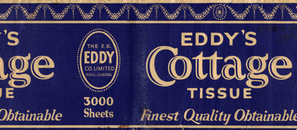
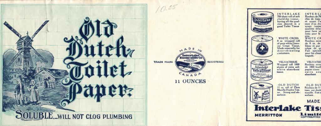
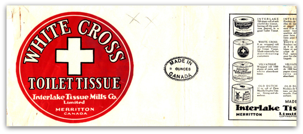
A couple of labels for national brands were also in the collection- in fact they were probably the manufacturers of the Davis lines.
You really never know where you are going to end up on this blog.
Postscript
- I suspect that most folks associate a winged wheel with the Detroit Red Wings. Here is a site with some great illustrations of what the folks in Yarmouth had in mind.
- The Markland hotel must have been quite a place. Here is a great collection of photos. I hope they used the family’s boudoir tissue.
