


Friday evening we realized we had not been downtown in the streets for a while so in we went. There was a satisfying amount of surface excitement with all the construction and demolition and folks sitting on the terraces. What caught my attention was the fragment of an old sign that has been exposed during the demolition of the Roy Building. My fellow blogger Peter Ziobrowski had tweeted the discovery earlier in the month and Gary Shutlak at the Archives had sorted out the business name (which was in the paper and I cannot remember or locate).
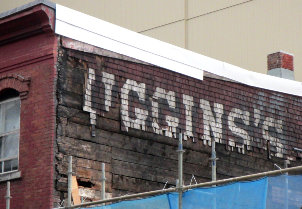
What a remarkable little find from the end of the century before last. It appears to have been cleaned up a bit since the discovery and you can see the shingles were painted a popular red ochre colour that worked well with coal soot.
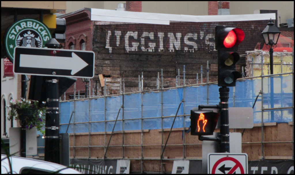
I continued to have a good view while having a glass of white in Obladee Wine Bar. The old sign held its own in the visual assault of contemporary signs and symbols.
This got me thinking about the big painted wall signs that used to be everywhere downtown a century ago. The last of these were still visible when I started taking pictures in the 70s. The most beloved advertised Shamrock Chewing Tobacco and covered the south wall of a building at the bottom of George St. In the late 70s there was an effort to save the building because of the sign but it was demolished to create the public space next to NS Crystal.
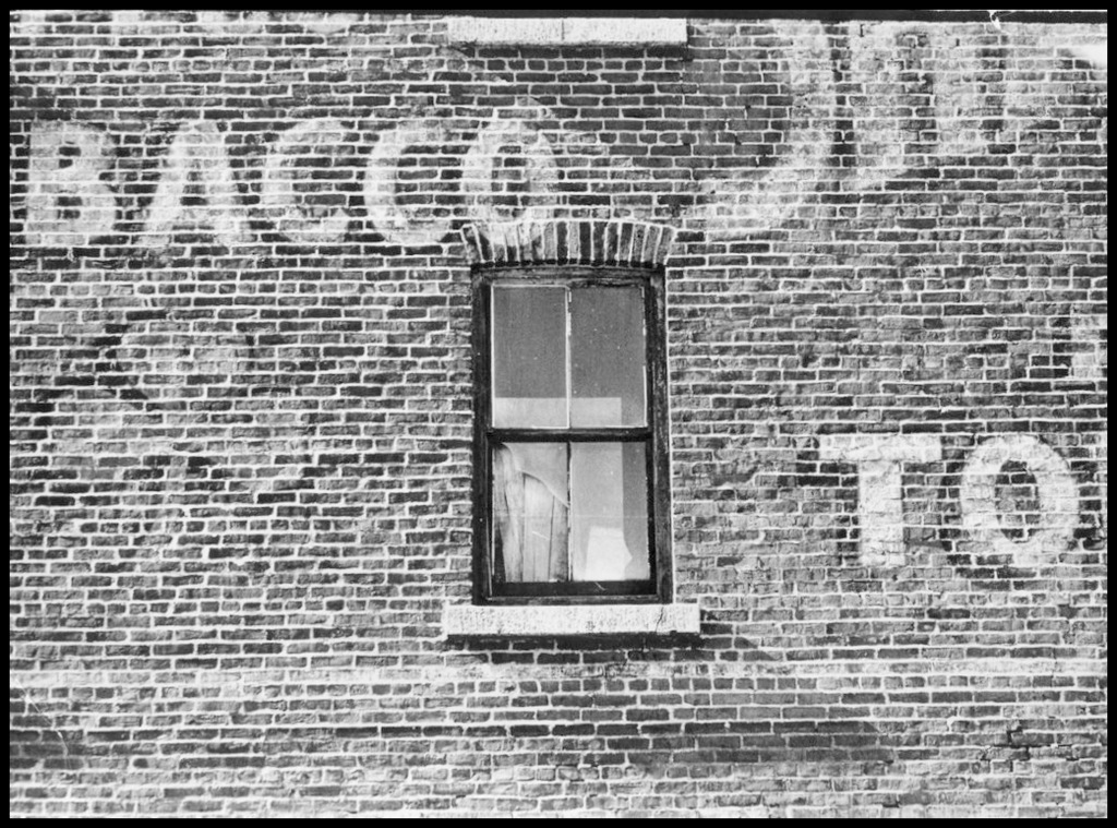
I believe that in St John and St John’s they still have examples of this sign. Sorry I only photographed a detail but at the time I was most interested in the typography and an artsy image.
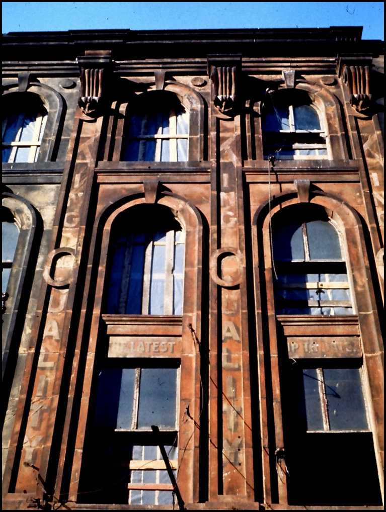
On the west side of the Granville St, where the mall is now, several buildings sported painted signs before the facades were taken down and reassembled. Again my tendency was to go for the detail. You can get a sense of the decay in this part of town in the 60s and 70s.
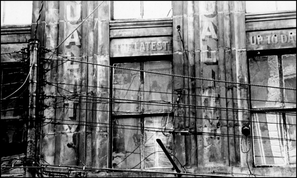
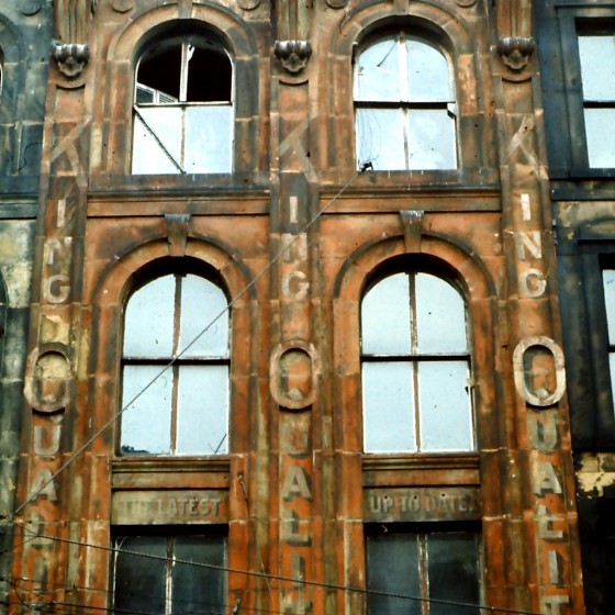
In this colour slide of the same sign you can see it advertises “King Quality” shoes. The sign painter has incorporated an oval element in the sandstone facade to make the “Q.”
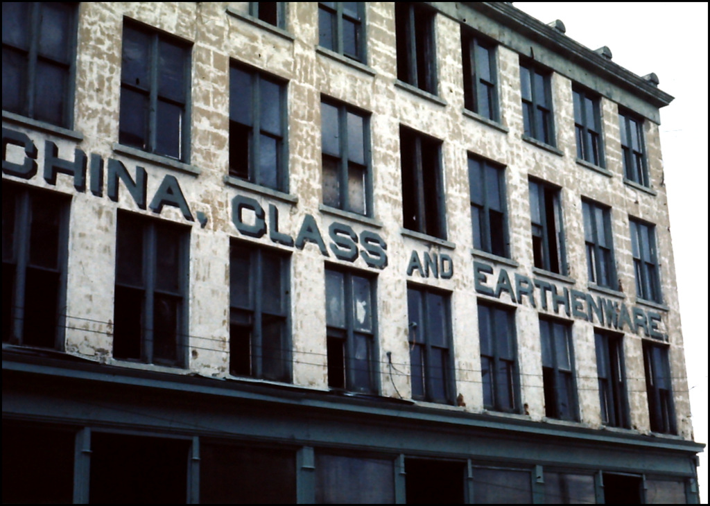
The business next door sold “China, Glass and Earthenware” I believe.
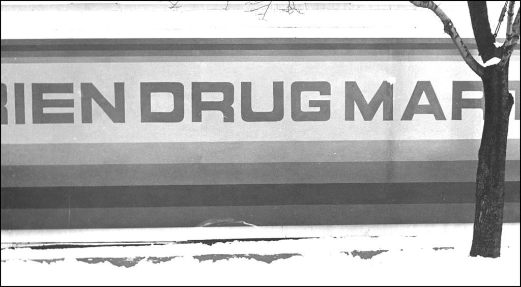
Here is a 1960s version of the practice from O’Brien Drugmart at the corner of Coburg and LeMarchant. At that time these were called super-graphics. The shop was just across the street from the Art College (before it moved downtown) and I suspect that might have influenced this exceptional sign painted in shades of purple.
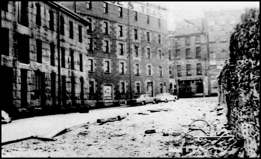
And then there is the Morse’s Tea Building with it’s infamous painted out sign. You can just see it at the top of the earliest of my photos from the mid 60s. This was when the whole area was going to leveled for Harbour Drive which accounts for the sense of abandonment.
There was a great article on the Teas sign controversy in Spacing Atlantic with really good photos of the building over time. It includes a mock-up of what a new sign might look like. The typeface they picked is almost identical to the one just uncovered on Barrington! Smart choice.
Painted signs in our urban landscape have always come and gone. Are there any contemporary examples out there that give you pleasure or would amaze if they were rediscovered 100 years in the future?
